I’m taking the rare step with this week’s piece and sending a printed copy – by mail – to each member of its primary intended audience. Because while yes, I want to share this message with you as well, there really are three people – or, in my worst nightmare, three groups of people – who it’s really intended for.
And the idea of the intended audience is what it’s all about.
Powered by RedCircle
If you go back to our talk from a couple of weeks ago, called “Don’t Find A Niche, Find The Right Niche“, we covered the importance of knowing exactly who you’re talking to, drilling down far enough that when you’re creating content for them – whether it’s advertising materials or a podcast episode – they are almost a corporeal entity, and the importance of committing to speaking directly to that person in a way that you never let them down. Not only does it prevent you from generating content that your audience won’t have use for, it also frees you up to talk to them in ways you maybe hadn’t previously considered. There was a similar thread in a piece we did called, “Norm MacDonald, Marketing Genius“, about giving your potential customers things that resonated with them, instead of whatever happened to be easiest to check off on your marketing checklist.
But perhaps most importantly, knowing and honoring your intended audience prevents you from insulting them.

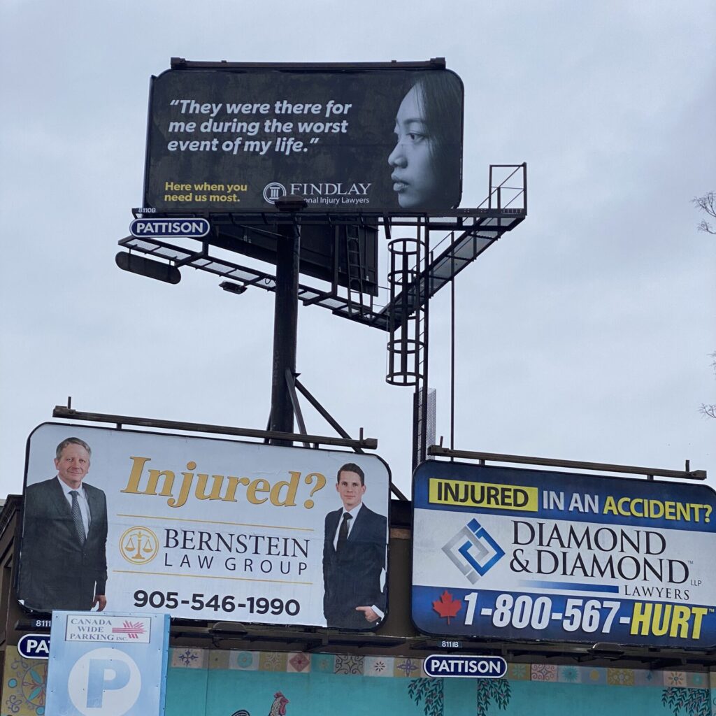
Recently I was in Hamilton, Ontario – a city of around three quarters of a million people, about a half hour’s drive west of Toronto – to give a talk to some local business leaders. And while I was there, I went on an extended walk, where I found the photo above. It’s directly across the street from Hamilton General Hospital.
I’ll let that sink in for just a second. Directly across the street from a hospital, three billboards for personal injury lawyers.
So let’s think about the intended audience for these billboards for a second. Really put ourselves in their shoes. And forgive me because I’m going to get really granular here.
Getting down to the absolute basics, who needs a personal injury lawyer? For starters, it’s far fewer of us than personal injury lawyers would have you believe, but that aside, it’s either a person who has been injured, or the family of a person who has been injured. They’ve just been through something. As one of the billboards suggests, it might be “the worst event of [their] life”. They’re probably feeling a million emotions, facing a hundred decisions, and now they’ve been presented with another one. But more about that later.
Let’s take a look, from the potential customer’s perspective, on the information presented in these ads.
If we’re going clockwise like what’s in the photo, there’s Choice A: A photo of a non-white woman, with a line that says, “They were there for me during the worst event of my life.” Now, that line doesn’t come with attribution, so it might be a line from a happy customer, or a line dreamed up by the person who created the ad. It might have been said by the woman in the photo. But we don’t know. It then offers the name of the firm in really tiny letters, and no contact information. So even if I wanted to call them, I have to now Google them, figure out if the firm Google gives me is the same as the firm in the ad, and then I can make a call.
Choice B doesn’t have any photography, just the color yellow to highlight the three things on the billboard it believes are the most important: The word “injured”, the word “accident”, and the word “HURT” in the phone number. They also emphasize the name of the firm, which is smart because locally, their radio commercials feature what you could describe as a “catchy” jingle that pretty much everybody in town knows. So hopefully, you see the name, that triggers the memory of the radio jingle in your head, and there’s enough familiarity there that you’re willing to try to figure out how to spell the word “HURT” on your phone.
Choice C is a picture of a couple of white guys, the word “Injured”, the name of the firm and an less easy-to-remember phone number that ends with what I’m willing to bet was the year the firm was founded – which makes it a much less catchy phone number 30-something years later.
So as someone who’s been in advertising in one form or another for 40 years, I can tell you that each of these individual ads fails on some level.
What’s far more egregious, though, is the strategy of having them all lumped together.
To begin with, putting all three ads on the side of the same building forces the same kind of competition that made The Yellow Pages such a terrible investment: If you’re advertising in the same visual place as one or more of your competitors, the automatic winner is whoever has the best ad. Best in terms of visual impact, placement, or whatever criteria you use to evaluate “best”. It’s why I’ll bet you have a pizza place in your town called “AAA Pizza”. It’s a throwback to the days of The Yellow Pages, where the important thing was being the first one listed in a given category. Even if your pizza was garbage, you’d pick up some customers by virtue of being the first ad they saw. Or, in the real glory days of The Yellow Pages, you’d see full-page ads for pizza places, in a visual attempt to scream the loudest for someone’s attention.
But putting three ads for personal injury lawyers across the street from a hospital doesn’t scream for attention. It screams desperation. And it reinforces the worst stereotypes about ambulance-chasing lawyers because, in this case, they’ve figured out that they don’t need to chase ambulances if they just ambush them at their destination.
Now, I could have used that last line as a mic-drop moment and just walked away, but I wanted to offer a solution. And one day, I’ll take another walk past Hamilton General Hospital to see if they actually took me up on it. But here’s what these three law firms could – and I would argue should – do with this ad space.
First let’s assume that the firms have chosen to advertise in this location because they have data that shows it’s a revenue driver for them. (By the way, if you don’t have that data, cancel the ads. They’re distasteful. Go back to the whole “ambulance chaser” thing if you’re still unclear on that.) Here’s what you need to recognize – each of the ads comes with a built-in barrier to entry that means unless I’ve contacted you while I’m looking at the billboard, I’m going to struggle on some level with how to get in touch with you, and that’s likely going to result in a Google search where I might not end up remembering you at all, but in fact go to one of your competitors. That effect gets multiplied exponentially if I’m trying to remember one of three choices that are all kind of hazy because of the fog of “the worst event of my life”.
To minimize “the ick factor” of the three ads being shoved in the face of an emotional, vulnerable person – if, again, you’re thinking at all about your intended audience like they were a human worthy of your respect – the three firms could negotiate a deal where they would rotate through the year. Firm A gets it for a month, then Firm B gets it, et cetera. Or three months. Or whatever time they agree to after they’re finished doing all that negotiating with each other that makes lawyers so rich to begin with.
Take the money you would have used for the ad space and use it to hire someone good enough to design ads that don’t have any barriers to entry and don’t have an “ick factor”.
But here’s where I get really crazy. During those months when your firm isn’t on the billboard? Pay for it anyway. And donate the ad space to a non-profit that offers help to your intended audience in other ways like crisis counseling or something else that might be useful to a person who’s going through “the worst event of [their] life”. Write it off as a charitable donation.
Look at the hospital as a place where your a member of your intended audience needs help. Not as a place they go so that you can take advantage of them..


